Introduction
Tourism is one of the sectors that offer the most significant contribution to the economic development of countries. It provides income and jobs to a region, while impacting different related industries (Martin et al., 2007).
Internet tourism research has a variety of thrusts involving both theory and practice (Cho and Fesenmaier, 2001; Zins, 2007).
Since the launch of commercial Internet applications in the early 1990s, many researchers have noted the potential of the World Wide Web in business, and advocated incorporating the Internet into the tourism industry (Burger, 1997; Clyde and Landfried, 1995). The rapid development of information technology in general and the Internet in particular has dramatically changed the tourism industry (Ho and Lee, 2007).
The tourism industry provides intangible products which are difficult to evaluate prior to consumption due to the fact that travel is an experiential activity (Litvin, Goldsmith and Pan, 2008). This implies that the information search effort within the decision-making process is a key factor. However, the Internet, thanks to the wealth of information which it incorporates, makes the appropriate stimuli available to influence the purchasing decision related to a travel product or service. On the other hand, due to the fact that the tourism business, like many others, continues to be more globalized, the competitive pressure on destinations increases (Baggio, 2003). This means that the growing competition makes the Internet a valuable tool for the marketing of destinations (Roney and Ozturan, 2006).
According to Azevedo (2009), websites are increasingly important tools in any marketing strategy. The paradigm shift in business development is leading the companies to the growing adoption of a relational model and direct communication with the consumer, as opposed to the traditional model in their marketing strategies.
The aim of the present study is to make a comparison analysis of Portugal and Spain websites managed by the Government agencies (visitportugal.com and spain.info). Both countries border the Mediterranean Sea forming the Iberian Peninsula.
Models for Evaluating Tourism Websites
The study of parameters to evaluate a website began years ago. There are a lot of models for evaluating Tourism Websites (Cavia et al., 2014; Kim, 2006; Villela, 2003; Azevedo, 2009; ISO 9126).
Bonjisse and Morais (2017) compared various models for evaluating Tourism websites and proposed another one. The proposed model intends to agglomerate the best practices of the different models compared. In our opinion, the model is very complete and made an analysis in several dimensions.
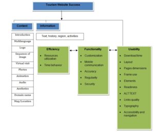
The model is presented and a description of its parameters is made.

Figure 1: Model of Evaluating Tourism Websites (adapted from Bonjisse and Morais, 2017)
Content
In fact, Huizingh (2000) differentiates the content dimension from design in websites, where content refers to information or services while design refers to the way in which information is presented.
However, combining information and design, Mentzas et al. (2006) assume the content criterion to be a sub-factor of quality dimension, providing some informational and presentational issues affecting the quality of e-government websites.
Multilanguage
In study developed by Azevedo (2009), ‟Multilanguage is the possibility of choosing a language between two or more‟. The Multilanguage is important so far as to facilitate the customers of several countries to navigate in their own languages in order to make it easier to interact using internet for booking or purchasing goods or services on website.
Logo
Logos designed according to traits of credibility (expertise and trustworthiness) were suggested to significantly increase the tendency of site visitors to stay and interact with a website Haig (2006). Logos or trademarks have long been considered an important part of corporate branding and visual identity strategies (Cohen, 1986; Dandridge et al., 1980).
Most of the literature on logo design has focused on primary characteristics of “good” logo design for example, that a logo should evoke positive feelings of familiarity and affinity, be recognizable, and communicate clear meanings (Hoyer and Brown, 1990; Henderson and Cote, 1998).
Sequence of Images
According to Azevedo (2009), Sequences of images are sequence of several photographs, usually of general scope and they alternate automatically. Sequence of images are important because it can make sure customers perceive a tourism product or services by marketing, promoting a destination through a mix of images about the place and influencing them to go to see and experiment at first hand the unique experience on their trip.
Virtual Visit
Actual reality-based 3D surveying techniques like laser scanning and photogrammetry are currently able to produce precise, detailed and photo-realistic 3D digital representations useful for documentation, archaeological and architectural analyses, visualization, divulgation and educational purposes, museum exhibitions or virtual tourism (Jimenez et al., 2016).
Unity plays a fundamental role for the management of complex reality-based 3D models and high resolution panoramic images and for the integration, synchronization and processing of various devices and data. Indeed, unity must communicate with different devices in order to coordinate a second display (Oculus Rift) and acquire and process the 3D data observed by the Kinect (Jimenez et al., 2016).
Virtual visit is currently important at once, people are becoming more familiar through the trends of technologies, and what are they need is just staying focused on easier tools to navigate to a certain destination. The 3D, gamification in e-tourism is true, customer’s behavior trends are more relevant when looking for tourism information before, during and after trip. The device of 3D makes sure customers get images visualization and experiences on their home or somewhere.
Photos
Digital photos are no longer seen as an act of memory, but rather as a tool for constructing self identity and communication. They are increasingly easily shared online with the masses, and they also empower people to shape their identities and memories (Vandjick, 2008).
Animation
Animation refers to a perception of “agency”, that is, an entity’s capacity to take self-directed action, to move in a life like fashion. For Hagtvedt (2011) distinguishes between “agent animation”, which gives viewers a sense that the logo moves of its own volition; and “object animation”, which does not. Agent animation connotes agency, e.g., the perception that the object moves on its own in a life like fashion (e.g., a jumping logo), while object animation entails motion that is not life like (e.g., a logo gliding down vertically). Hagtvedt (2011) reports that agent animation encourages more favourable attitudes toward a “dynamic” firm (e.g. an entertainment company), but less favourable attitudes toward a “stable” firm (e.g., an insurance company). Furthermore, favourable attitudes arise when the brand personality suggested by the animation is consistent with other brand cues, such as brand slogans or the logo graphic. Despite these findings, Hagtvedt (2011) did not investigate whether or not movement direction has an effect on consumer attitudes toward firms and their logos. Thus, a significant gap exists in the scant literature on logo movements.
Audio
The audio element is used to embed sound content in a HyperText Markup Language (HTML) document. The audio element was added as part of HTML5 (Van Dijck, 2008). The audio comes to reinforce sound entertainment to users. The YouTube platform is an example that is more visible, and helps them to socialize on internet trough video presentations.
Aesthetics
Just like people use various cues derived from the outward appearance of a person to form a first impression (Brewer, 1988), visual design is used to quickly form an opinion of an artefact in the context of human computer interaction (Kim and Fesenmaier, 2008).
Sillence, Briggs, Harris, & Fishwick (2007) for instance, found that users tend to rate high quality content websites low if they are poorly designed. This result is an example of a halo effect Nisbett and Wilson (1977), e. g.; a form of judgment bias occurring if the judgment of a property influences other (usually unrelated) judgments. Schenkman and Jonssons (2000) found that aesthetics are the best predictor of a website’s overall evaluation, underlining the importance of aesthetics as a result of halo effects.
Domain Name
A domain name is what a person enters in their internet browser’s address bar to access a website (Kim and Fesenmaier, 2008). The domain name is important to users when they wish to obtain information, also it assists users in selecting desired domains in the internet.
Map/location
According to Azevedo (2009), Phone and email contact information are essential to a destination. Map/location is very essential as well, because it guides a point of information for the destination about the location, it can give Google-map, address, phone number and email contact of a selected location.
Text
Text refers to all information available to the users on the websites (Kim and Fesenmaier, 2008).
History
A Descriptive text on the origins of the country/destination or historical context where it is located. Azevedo (2009).
Region
Region in the web page refers to the references, texts and / or images about the region where the country or destination is located (Azevedo, 2009).
Activities
Activities are the Information about various leisure activities available on the destination and / or the countries exposed on the website (Azevedo, 2009).
Usability Approaches
Usability is a new knowledge (since the 80’s) that is concerned with the characteristics of the software (and websites) so that it is considered easy and pleasant to use (Jakob and Tahir, 2000).
Usability is a qualitative attribute that measures the ease of use of an interface in its “Usability‟.
This concept also applies to the methods used during the design of the website to enhance the ease of its final use.
The authors define usability as being the result composed of 5 characteristics:
1) Accessibility / understanding: ease with which users grasp the basic tasks of the website the first time they visit it.
2) Efficiency: how quickly users take advantage of the website after getting used to its design.
3) Memorization: How easily do users use the website after a period of absence? That is, your first visits to the website were enough to, after absence, resume efficient use of it?
4) Errors: Regarding the errors that occurred during the use of the website, it is necessary to evaluate how many, how serious and how easy it was for the user to recover from these errors.
5) Satisfaction: degree of pleasure in using website design.
According to Azevedo (2009), they also highlight an additional characteristic that is considered important: utility. This concept relates to the effective functionality of the design, and has to do with the real satisfaction of the user’s needs. Usability and utility complement each other to produce a positive effect. In short, the important thing is to respond to the needs of the user and not only to provide satisfaction while browsing the website, but it is no use for the website to contain the necessary answers for the user if these answers are conditioned by inadequate interface.
The book is a regular reference when it comes to usability. In it, web pages are considered real estate of the most valuable. The authors point out that enormous amounts of money are here applied in a space that is not even one square centimeter in size. The website is the face of the organization presented to the world, and potential customers look at it before eventually doing some business. That is why complexity or confusion can alienate customers.
Accessibility and usability are key features in any application or website. They reinforce each other in the design of websites, since accessible websites are more usable and vice versa. For this reason, accessibility is an essential principle in technology, and even more so in the web. The social value of the websites is that it enables human communication, commerce, and opportunities to share knowledge (Rodríguez, et al., 2017).
Download Time
According to Jakob Nielson (2000), “Every web usability study has conducted since 1994, has shown the same thing: Users beg us to speed up page downloads”.
In other words, file size is a crucial factor in web usability. Most of us who have spent any time on the web, particularly on a dial up modem, would have to say a big “duh” to this, given how annoying it can be to wait for a long download and how quickly we will leave a page that is not crucial, instead of waiting. In his 2000 book, Nielsen quotes a classic paper by Miller (1968), which specifies a relationship between computer response time and users’ perceptions: 0.1 second = limit for having the user feel the system is reacting instantaneously; 1 second = limit for user’s flow of thought to remain uninterrupted; and 10 seconds = the limit for keeping user’s attention focused on the dialogue.
Nah (2004) said that although the long download time of Web pages has been a consistent problem encountered by Web users, it is still controversial as to what constitutes an acceptable waiting time for a typical Web page download. Interestingly and ironically, the average of the American users that use dial-up connections wait about 30 seconds the first time they look at a new Web page (Nah, 2004).
Layout
According to Karkin (2014), since website layout is a very subjective issue, we focused on Cascading Style Sheets (CSS); a system which enables a consistent style among the different pages.
The World Wide Web consortium (W3C) defines CSS as “a simple mechanism for adding style (e.g., fonts, colors, spacing) to Web documents” (http://www.w3.org/Style/CSS/#specs). Thus, if a website has no issues related to CSS, this means that it is interoperable via web browsers in terms of style.
Pages Dimensions
According to Web Style Guide (WSG, 2004), although Web pages and conventional print documents share many graphic, functional, and editorial similarities, the computer screen, not the printed page, is the primary delivery site for Web-based information, and the computer screen is very different from the printed page. Computer screens are typically smaller than most opened books or magazines.
A common mistake in Web design is spreading the width of page graphics beyond the area most viewers can see on their seventeen- or nineteen-inch display screens.
Frame Use
According to WSG (2004), frames are meta-documents that call and display multiple HTML documents in a single browser window. A frame document contains no BODY HTML tags, just the parameters for the frames and the URLs of the HTML documents designated to fill them. Frames-based pages do not function as an integrated unit, which is both good and bad. Frames are useful for certain content and greatly facilitate site maintenance. They provide a good way to maintain narrative and design consistency in your site; you can split the browser screen between site navigation and the material you wish to bring up with a link.
Frames are useful in a site whose contents are expected to change frequently. Because a frames-based site can be designed to have a single file for navigation, if you add or remove pages from the site, you will have to modify only that one file.
Elements
According to Karkin (2014), although visual elements can be measured by various criteria to evaluate usability through the following criteria such as website performance at low resolutions, website appearances using different browsers, the availability of different language choices, and the presence of animation site search function.
Readiness
Discussing the diverse definitions of e-readiness, Web Style Guide (2005) observes that the term represents multiple levels of Information Communication Technology (ICT) development and that exact definition of what constitutes ″e-readiness″ is still open for debate.
Similarly, agriculture and food in Canada found in 2001 that there are many degrees of e-readiness, which could include any one or more of the following.
- Using e-mail as the most preferred communication method
- Using a website for external and internal communication
- Selling goods and/ or services using online internet services
- Findings and purchasing computer equipment and software, supplies or services through a company website
- Sending electronic invoices to consumers and receiving electronic bills from suppliers
- Paying and receiving payments electronically, the choice of e-readiness too largely depends on the purpose and goals of the particular assessment.
Alt Text
According to Godinho and Fernandes (2003), most technology makes life easier. For a person with special needs, technology makes things possible.
The use of a computer and Internet access allow these citizens (undoubtedly those facing the greatest obstacles, both physical and social) to access a huge pool of (in) training, make contacts and exchange Information, exercise an activity, find alternative forms of leisure and fun, and increase their relationships of friendship, in short, build a life with meaning.
For example if the presence of daily newspapers on the Internet is for most people more a way to access information content, for a blind person is the only way to see the news of the day in real time . No invented medium until now made the information available to him, so immediately and so easily.
Microsoft has realized very early the importance that Information Technology (IT) has for people with disabilities. Systems such as Windows, and all the software developed by the company for this system, have contemplated accessibility features. This perception has even been induced by the strong legal component in the United State (US), where not only legislation is extremely demanding but also the anti-discrimination movement makes use of powerful lobbies.
Being aware that it is necessary to draw attention to and understand the importance of the new IT for Citizens with Special Needs, and the value that such thinking has in contemporary society, the video has been created “Enable – The People with Disabilities and the Computer” by Contributing to improving the general attitude of the population towards people with disabilities.
The video shows the importance of technical aids and highlights the capabilities of people with disabilities and how they overcome their disadvantages.
The “Enable” video shows how people with disabilities are using their personal computers, at home, at work and at school, to enable them to live productive and fulfilled lives.
There are other companies like Apple and IBM that also have wide experience in the sector. More recently, it is common for operating systems to also come equipped with on-screen keyboards, high contrast and magnification systems, and mouse-over keyboarding, as well as the production of subtitles for audible warnings.
Link Quality
Having direct effects on demand and supply sides of e-government services, the service quality of website is assessed in terms of user satisfaction. User satisfaction is dependent on factors such as the maturity of websites, the level of government (local, national, or federal), and how well the needs of the citizens visiting the websites are identified and met (Bhattacharya and Gupta, 2012).
Garcia et al. (2005) point to three constitutive features that e-government websites must possess regarding quality: meeting the information needs of citizens; rendering services that allow citizens to make online transactions (e.g. sending a request and receiving an answer); and harnessing the full potential of citizen engagement in public policy design and implementation. However, an evaluation of website quality is not easy to perform. Previous studies show that user perceptions and visitor feedback are important means for measuring the quality of e-government portals and websites (Alias et al., 2011).
Typography
Bringhurst (1997) explains that typography is the balance and interplay of letter forms on the page; a verbal and visual equation that helps the reader understand the form and absorb the substance of the page content. Typography plays a dual role as both verbal and visual communication. As readers scan a page, they are subconsciously aware of both functions: first they survey the overall graphic patterns of the page then they parse the language, or read. Good typography establishes a visual hierarchy for rendering prose on the page by providing visual punctuation and graphic accents that help readers understand relations between prose and pictures, headlines and subordinate blocks of text.
Accessibility and Navigation
As known from the literature, accessibility means that websites are reachable by citizens who have physical, motoric or perceptual disabilities Lazar and Olalere (2011). Based on its very nature, government websites must be sensitive to accessibility issues in order to ensure equal access. Furthermore, Kopackova and Michalek (2010) state that “public administration websites must be accessible inherently, since their purpose is to provide information to everyone without any exception”. Since the general well-being of websites is largely conditioned to the size and level of government in terms of social, financial and administrative aspects, local government websites may include some technical and usability deficiencies comprising accessibility issues when compared to national or federal levels of government (Kopackova and Michalek, 2010).
Functionality
In their pioneering study pertinent to an effective commercial website application, Lu and Yeung (1998) state that two major components affecting usefulness of a website are functionality (i.e. content) and usability (i.e. design). High website usability can certainly encourage users to spend a longer time viewing the website and to come back again later. Website functionality, concerning whether the website provides sufficient information to help users accomplish their intended purposes, is more critical given that information provision and is the basic goal of a website. Since content quality is one of the most important factors that travelers seek when booking through an online reservation site (Dickinger and Brigitte, 2013; Perdue, 2002).
Customization
In particular, the diffusion of customization practices has been boosted by the increasing application of web toolkits. Customization web toolkits consist of the sets of configurators, choice menus and design kits that allow the customer to interactively customize her/his own product.
Franke and Schreier (2008) in web-enabled customization approaches, the customer plays an active role in the product definition thanks to interactive and involving toolkits, which enhance preference fit and the customer feeling of being the designer of her/his customized product.
Based on such advancements, the interactive marketing literature has classified customization models based on the degrees of freedom allowed to customers in the design process. Some studies Randall et al. (2005) have related design freedom to the potential combinations of product modules provided by the company to the customer. In addition, Franke et al. (2008) have defined the degree of design freedom considering the opportunity for the customer to add content to the product beyond predefined modules. They apply to the customization context the concept of consumption integration, which has been proposed in the consumer behaviour literature to indicate practices of product manipulation aimed at linking the self and the object (Holt, 1995).
Mobile Communication
Science information was formerly delivered to the public by the mass media in the form of news and magazines. On the one hand, this was seen as one part of the expository phase of scientific practice, which is vital to the scientific enterprise Gregory and Miller (1998) and an integral component of the knowledge production Whitley (1985) on the other hand, science news has tended to be judged rather negatively by the scientific community (Lewenstein, 2001).
Since such representations differ greatly from traditions established in the textualization of scientific knowledge in research articles, science news is generally considered by the science community as being simplistic, inaccurate, sensational, and biased (Lewenstein, 2001).
It has been considered, however, that the ‘authority-to-public’ model has been turned ‘inside-out’ as the Internet and social media have shifted the boundaries between previously separated spheres of communication (Trench, 2008).
Science news is no longer consumed in isolation as it used to be, but instead is now contextualized by cues such as Facebook likes, readers’ comments, or Twitter mentions (Brossard and Dietram, 2013).
Accuracy
The accuracy is integral to evaluating health-related information on the Internet when it comes to the accuracy and quality of the information presented to audiences. Accuracy refers to the communication of information that is consistent with accepted recommendations (Bonnar et al., 2009).
Accuracy is needed so as to satisfy the customers need and want so as to have good and positive images of the site, so this element is crucial to a site.
Regularity
Regularity is important to a website of goods and services. This includes being always up to date and changing tools, and adapting to the use of new technology (Bonnar et al., 2009).
Security
According to Ismailova (2017), security is a crucial point in government web sites. Governmental infrastructures must support authentication, confidentiality and integrity, and the public key infrastructures (PKI) must be used to develop a new trust model. Besides this, there are problems related to the use of Web solutions as well. Poor coding practices can make Web applications vulnerable to attacks such as Structured Query Language (SQL) injection and cross-site scripting, which can cause disruption of service and loss of data, or bring the web application to a complete halt. In government web sites, consequences of such attacks can be disastrous.
Efficiency
Efficiency is comprised by two items such as resource utilization and time behaviour, efficiency is an issue that has raised a great interest within the scientific community. This interest is driven by the fact of living together in a highly competitive environment in which the first proposal to improve the profitability is to optimize the efficient use of resources (Tavares, 2002).
The efficiency is necessary in order to minimize and to optimize the use of resources utilization, time behavior (Seiford, 1997).
Methodology
The methodology used in this study is conducted using the qualitative method approach – comparative descriptive which aims to analyze the Portugal and Spain websites looking on their marketing tools, pages, menus, submenus, images, videos, content of information, links, regions, aesthetics, logo, domain name, map/location, animation, virtual visit, audio, etc.
Based on Bonjisse and Morais (2017) study, where they presented a list of dimensions and attributes to evaluate tourism websites, a list was built for the variables that were used to evaluate the official destination websites of Portugal (https://www.visitportugal.com) and Spain (https://www.spain.info). For that, content analysis was applied, considering the previous dimensions found on the literature review. This way, each website was seen based on previous defined dimensions for the content analysis.
Comparison of Portugal and Spain
The evaluation of Portugal and Spain websites is based on classification used from Azevedo (2009), in his study entitled ″A Proposal of Housing Tourism Websites Model″.
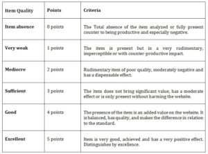
Table 1: Scale of quality applied to analyzed items (adapted from Azevedo, 2009)

Azevedo (2009) said the evaluation process is supported on a value scale ranging from 0 to 5 and is shown in table 1. It should be noted that the evaluation criteria should be understood according to the nature of the item to be evaluated and inevitably have a personal and subjective nature of the evaluator in question. In an ideal situation, the use of several evaluators would give greater solidity to the results and decrease the subjectivity.
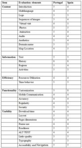
Based on the model presented in Figure 1, the evaluation of the websites of Portugal (https://www.visitportugal.com) and Spain (https://www.spain.info) for each of the parameters of the model was made using the scale of Table 1. This evaluation is compiled in table 2.
Table 2: Comparison between Portugal and Spain official tourism websites

From the analysis of the websites, we can conclude that there is a great concern in divulging what the best each country offers.
The Portuguese site is more dynamic than Spanish. Regarding Multilanguage, the Spanish site has more languages than the Portuguese (24 against 10).
In the available apps, there is a greater variety of operating systems available on the Portuguese site (windows, IOS, Android), in Spanish, it only exist for IOS and Android.
Both sites have security protocol (https) and both disparage the country’s history.
With regard to customization, the Portuguese site allows the user to create a profile and add content and planning, contrary to the Spanish site which does not allow any registration.
Most of the items on the two sites are between good and excellent, which shows a great concern in providing quality content through the internet, clearly the largest means of communication and dissemination of tourism.
Conclusion
It is clear that the need for websites to better exploit the interactive capabilities of the internet to capture tourist imagination in the travel purchase decision making (Beldona and Cai, 2006).
A successful tourism business nowadays depends on the new technology, connectivity, and is also related to the consumer behaviour in planning a vacation. The following results were found in the classification of the items with prudence of excellence in both countries: links quality, accessibility and navigation, typography, security, time behavior, domain name and logo.
Even though a specific case was investigated (the Portugal and Spain websites), the methodology applied here can be used in any other destination.
We can say that both Portugal and Spain are concerned about their official tourism sites. Issues such as usability, functionality and efficiency are considered important. Both give little importance to the history of the country, which in our view should be added.
Acknowledgments
UNIAG, R&D unit funded by the FCT – Portuguese Foundation for the Development of Science and Technology, Ministry of Science, Technology and Higher Education. UID/GES/4752/2019.
(adsbygoogle = window.adsbygoogle || []).push({});
References
- Alias, E., Idris, S. and Kasimini, H. (2011), ‘Evaluating e-government services in Malaysia using the EGOVSAT model,’ Eletrical Engineering and Information, Bandura, Indonesia, 1-5.
- Azevedo, D. (2009), ‘Proposal of Home website Evaluation model in Tourism’, Porto University.
- Baggio, R. (2003), ‘A website analysis of European tourism organizations,’ International Journal of Tourism and Hospitality Research, 14(2), 93–106.
- Beldona, S. and Cai, A. (2006), ‘An exploratory evaluation of rural tourism websites,’ Journal of Convention & Event Tourism, 8 (1), 69 – 80.
- Bhattacharya, D. and Gupta, G. (2012), ‘E-service quality model for Indian government portals: Citizens’ perspective,’ Enterprise information management , 246-271.
- Bonnar, K., Black, K. and Mattson, M. (2009), ‘Online physical activity information: will typical users find quality information?,’ Health communication.
- Brewer, M. (1988), ‘A dual process model of impression formation,’ Advances in Social Cognition, 1.
- Bringhurst, R. (1997). The elements of Typographic Style (2 ed.). Canada, USA, Hartley and Marks Publishes.
- Bonjisse, B. and Morais, E. (2017), ‘Evaluation of Tourism Websites’. In 29th International Business Information Management Association Conference – Innovation Management and Education Excellence Vision 2020: from Regional Development Sustainability to Global Economic Growth. Viena, Austria, 2017. ISBN: 978-0-9860419-7-6
- Brossard, D. and Dietram, S. ( 2013), ‘Science, new media, and the public,’ Science, 40-41.
- Burger, F. (1997), ‘TIS@WEB-database supported tourist information on the Web’. In A. M. Tjoa (Ed.), Information and communication technologies in tourism 1997 (pp. 39–46). , New York: Springer-Wien.
- Cavia, J. F., Rovira, C., Luque, P. D. and Cavaller, V. (2014), ‘Web Quality Index WQI) for official tourist destination websites. Proposal for an assessment system,’ Tourism Management Perspectives, 9, 5–13.
- Clyde, S. and Landfried, T. (1995), ‘Our town: a distributed multimedia system for travel and tourism’. In W. Schertler (Ed.), Information and communication technologies in tourism 1995 (pp. 17–28). New York: Springer-Wien.
- Cohen, D. (1986), ‘Trademark strategy,’ Journal of Marketing, 50, 61–74.
- Cho, Y. -H. and Fesenmaier, D. R. (2001), ‘A new paradigm for tourism and electronic commerce: experience marketing using the virtual tour’. In D. Buhalis, & E. Laws (Eds.), Tourism Distribution Channels: Practices, Issues and Transformations (pp. 351–369). London, New York: Continuum.
- Dandridge, T., Mitroff, I. and Joyce, W. (1980), ‘Organizational symbolism: A topic to expand organizational analysis,’ Academy of Management , 77-82.
- Dickinger, A. and Brigitte, S. (2013), ‘Website performance and behavioral consequences: A formative measurement approach,’ Journal of Business Research , 771-777.
- Franke, N. and Schreier, M. (2008), ‘Product uniqueness as a driver of customer utility in mass customization,’ Marketing Letters, 93-107.
- Garcia A.C.B., Maciel C., Pinto F.B. (2005), ‘A Quality Inspection Method to Evaluate E-Government Sites’. In: Wimmer M.A., Traunmüller R., Grönlund Å., Andersen K.V. (eds) Electronic Government. EGOV 2005. Lecture Notes in Computer Science, vol 3591. Springer, Berlin,
- Godinho, F. and Fernandes, J. (2003), Accessibility to websites, Citizens with Special Needs.
- Hagtvedt, H. (2011), ‘The impact of incomplete typeface logos on perceptions of the firm,’ Marketing , 86-93.
- Haig, W. (2006), ‘How and why credibility-based company logos are effective in marketing communication in persuading customers to take action: A multiple case study toward a better understanding of creativity in branding’. Southern Cross University, Lismore, Australia.
- Ho, C.I. and Lee, Y.L. (2007), ‘The development of an e-travel service quality scale,’ Tourism Management, 28(6), 1434–1449.
- Holt, D. (1995), ‘How Consumers Consume: A Typology of Consumption Practices,’ Consumer Research , 1-16.
- Huizingh, E. (2000), ‘The content and design of web sites: An empirical study,’ Information and Management, 123-134.
- Ismailova, R. (2017), ‘Web site accessibility, usability and security: a survey of government web sites in Kyrgyz Republic,’ Universal Access in the Information Society, 257-264.
- Jakob, N. and Tahir, M. (2000), ‘Homepage Usability:50 Websites Desconstructed’ [Online], [Retrieved August 11, 2009], http://www.useit.com/homepageusability
- Jimenez, B., Morabito, D. and Romandino, F. (2016), ‘Access to complex reality-based 3D models using virtual reality solutions,’ Culture and Heritage , 40-48.
- Karkin, N. (2014), ‘Evaluating Websites from a public value perspective: a review of Turkish local Government Websites,’ International Journal of Information Management , 351-363.
- Kim, J. H. (2006), The effects of tourism information web site factors on usefulness, web site attitude and behavior. Ph.D., Sejong University, Seoul.
- Kim, H. and Fesenmaier, D. (2008), ‘Persuasive design of destination web sites: na analysis of first impression,’ Travel Research , 3-13.
- Kopackova, H. and Michalek, K. (2010), ‘Accessibility and findability of local e-government websites in the Czech Republic,’ Universal access in the information society , 51-61.
- Lazar, J. and Olalere, A. (2011), ‘Accessibility of US federal government home pages: Section 508 compliance and site accessibility statements,’ Government Information Quarterly, 28(3), 303-309.
- Lewenstein, B. (2001), ‘Science and the media,’ In International encyclopedia of the social and behavioral sciences. (N. Smaler, Ed.)
- Litvin, S., Goldsmith, R. E. and Pan, B.(2008), ‘Electronic word-of-mouth in hospitality and tourism management,’ Tourism Management, 29, 458–468.
- Lu, M. and Yeung, W. (1998), ‘A framework for effective commercial web application development,’ Internet Research, 166-173.
- Martin, H.S. and Rodriguez del Bosque I.A (2008), ‘Exploring the cognitive affective nature of destination image and the role of psychological factors in its formation,’ Tourism Management,
- 29 (2), 263 – 277.
- Mentzas, G., Halaris, C., Papadomichelaki, X. and Magoutas, B. (2006), ‘A Review of Quality Dimensions in e-Government Services,’ Public Administration in the information age .
- Miller, R. (1998), ‘Response time in man-computer conversational transactions,’ AFIPS Conference, 267-277.
- Nah, F. (2004), ‘A Study on Tolerable Waiting Time: How Long are Web Users Willing to Wait?’. Proceedings of the American Conference on Information Systems (AMCIS). Behaviour and Information Technology , 2212-2222.
- Nielson, J. (2000), Designing Web Usability: The Practice of Simplicity, New Riders Publishing Thousand Oaks, CA, USA.
- Nisbett, R. and Wilson, T. (1977), ‘The halo effect: Evidence for unconscious alteration of judgments,’ Personality and Social Psychology, 250-256.
- Perdue, R. (2002), ‘Internet site evaluations: the influence of behavioral experience, existing images, and selected website characteristics,’ Travel and Tourism Marketing, 21-38.
- Randall, T., Christian, T. and Ulrich, K. (2005), ‘Principles for user design of customized products,’ California Management Review , 68-85.
- Roney, S. A. and Ozturan, M. (2006), ‘A content analysis of the web sites of Turkish travel agencies,’ International Journal of Tourism and Hospitality Research, 17(1), 43–54.
- Rodríguez, G., Perez, J., Cueva, S. and Torres, R. (2017), ‘A framework for improving web accessibility and usability of Open Course Ware sites,’ Computers and Education,195-215.
- Schenkman, B. and Jonssons, F. (2000), ‘Aesthetics and preferences of web pages,’ Behaviour and Information Technology, 367-377.
- Seiford, L. (1997). ‘A bibliography for data envelopment analysis (1978-1996),’ Annals of Operations Research , 393-438.
- Sillence, E., Briggs, P., Harris, P. and Fishwick, L. (2007), ‘How do patients evaluate and make use of online health information?,’ Social Science and Medicine, 1853-1862.
- Tavares, G. (2002), A bibliography of data envelopment analysis. RUTCOR, Rutgers University Trench, B. (2008). Internet: turning science communication inside-out?
- Vandjick, J. (2008), ‘Digital photography: communication, identity, memory,’ Visual Communications, 57-76.
- Villela, R. M. (2003). Contents, Usability and Functionality, three dimensions to analyse eletronic Government Portal State Web.
- Web Style Guide (2005). Amazon.com
- Whitley, R. (1985), ‘Knowledge producers and knowledge acquirers,’ Expository science: Forms and functions of popularisation, 3-28.
- Zins, A. H. (2007), ‘Exploring travel information search behavior beyond common frontiers,’ Information Technology & Tourism, 9, 149–164.
